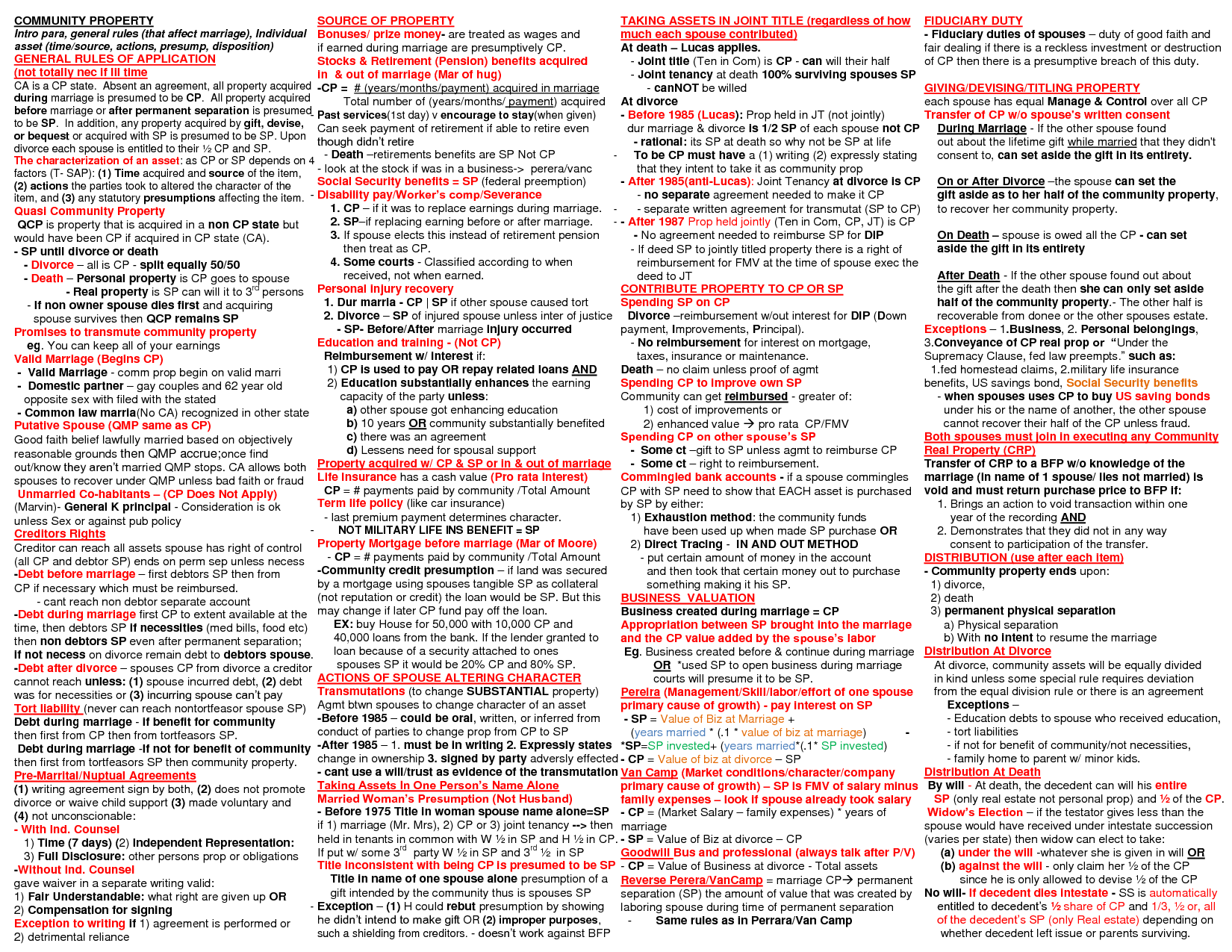
I’ve been tunnel-vision studying for the California Bar, and in the process, I’ve been trying to hunt down graphics & visuals that will give me a break from text-madness of Bar Prep. I have chanced across one-pagers like this on California Community Property.

This is a one-page headache. Or heart attack?
This is what is wrong with the state of Legal Information Design.
Different colored fonts do not save this insanity.
I love the ambition of simplifying a whole area of study into one simple page. I love a good graspable overview. But in the name of efficiency, this kind of creature emerges: dense, terrifying, so you want to go lock yourself in the closet and pretend you never even heard of the notion of Community Property.
It’s also a gauntlet being thrown down. If the appetite is there (especially from me) for law that’s summarized quickly and cleanly, then there’s a healthy design challenge to compose something that gets that job done. And that does not involve 6pt font, inscrutable acronyms, and hardly an inch of white space to rest your eyes.
2 Comments
I am doing this stuff with Art Science and Ethics of 21st Century retainer agreement – but I have limited design skill. Can I send you my materials – I have given a lot if thought in how to structure agreements to keep in only what’s needed. I am the only person doing this and have tried contacting the NU lab to collaborate with no avail. How can I get in touch?
Margaret, did you make any flow chart for community property? I think you flow charts are sooooo helpful in studying for my finals. I found that it helps me go back to my own notes and start doing flowcharts myself! Thank you!