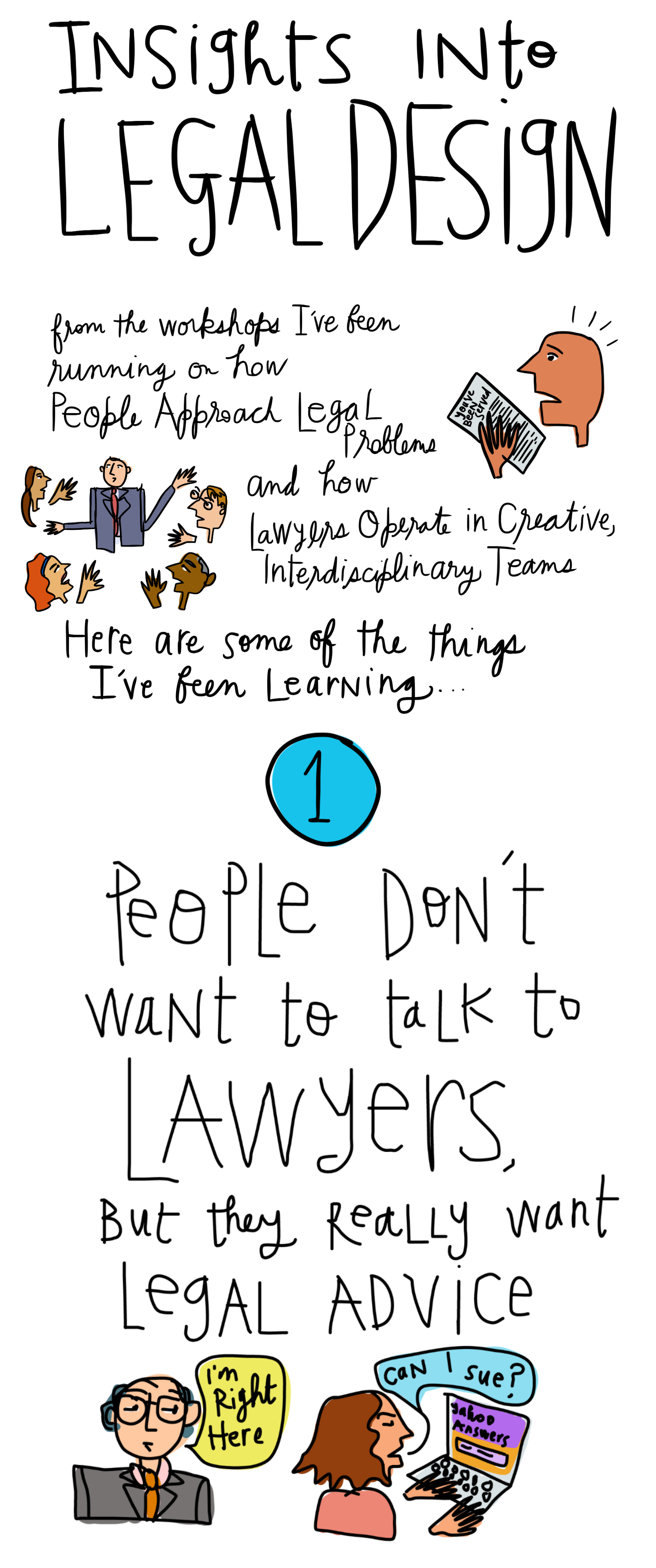
On his blog “the [non]billable hour”, legal consultant Matt Homann challenged law firms to design a more readable, engaging, client-centered bill for legal services.
If your clients designed your bills, what would they look like? Would they be easier to understand? Contain useful case status information? How about upcoming dates or milestones? Would your bills include information about the people who worked on the case that month? How about a report card seeking monthly feedback about how you’re serving your clients?
This is an exercise in document design, with a focus on the quality of the client experience. The exercise is not just to make the information more understandable with better fonts & composition, but also to improve the lawyer’s relationship with the client by including other types of information, context & direction.
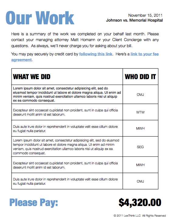
Homann proposes one concept design for what a more client-centered bill may look like:
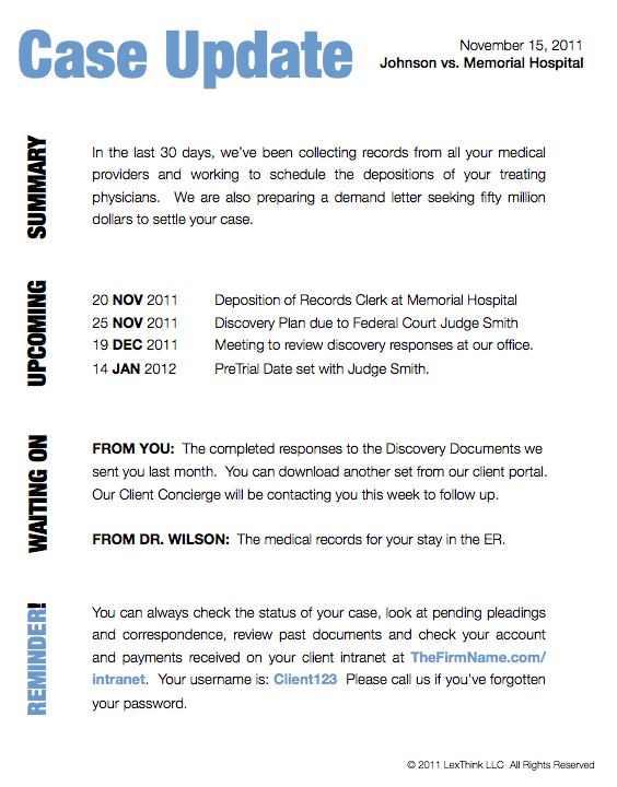


 There are several design principles at work here, worth noting:
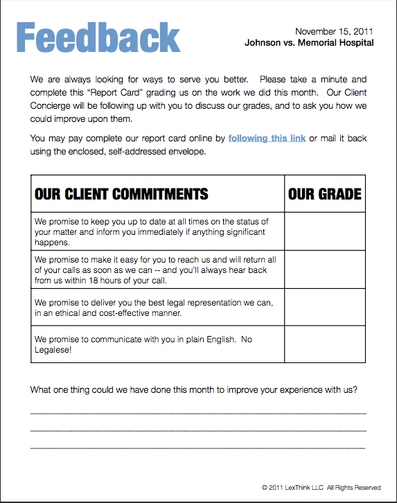
- Clean composition: Large fonts, uncluttered text, and the use of tables/large breaks keeps the document highly readable.
- Digestible structure: One topic per page makes the entire document more scannable & quickly digestible to a reader — especially one that is an anxiety-prone mindset of having just received a bill in the mail.
- Opportunity to interact: The document gives an entry-point for the client to speak back to the document/lawyer — perhaps not on the prices themselves, but on the quality of the work, through the final feedback page. This makes the communication more two-way — and more satisfying to the client — even if she chooses not to fill in the form. Just the invitation to reply makes the relationship seem less one-way & imbalanced.
- Context for transparency & understanding: The document is not just a set of tasks and prices. It tells who did the work, what the ‘summary narrative’ of the work was, and what else is happening. This puts the task-price list into a broader context, that gives more clarity to the client who is trying to parse through what they are paying for & why.
- Easy action paths: Putting clear links to actions to take for payment or follow-up lets the client respond quickly & without having to think too hard about what to do next.
Some suggestions for improving this further, from the client’s perspective:
- Increased price transparency: Put a column of costs in the “Our Work” table, to make it very clear exactly where the “Please Pay” number comes from. Otherwise, the number seems arbitrary & likely to induce push-back.
- Identify each team members’ role on the case: The client may be able to figure out what exactly each of the four team members is doing for her if she spends time looking them up, calling Matt, or parsing through the ‘Who Did It’ column on Our Work. But it would be more user-friendly to tell the client a role-title for each of the team-members, as it relates to her case. Even if the bill lists off the team-member’s ‘law firm title’ (e.g., junior associate), that doesn’t give much of a clue as to what role they are playing on the client’s project. What is the junior associate’s purview, what tasks does she work on, what is her role title vis-a-vis the client, not vis-a-vis the firm?
- Have easy actions for all clients’ tasks: If the client has to take an action, make it very clear how to take this action. Ideally, give her a one-click solution to take it. In the ‘Waiting On’ section, have hyperlinks to any documents she needs to download and process. Let her take care of everything as easily & clearly as possible.
- Create a To-Do hierarchy for your client: even at 5 pages (or 4, without the title page), the bill can be a little long. The white space and one-topic per page, though, is nice enough that it’s worth preserving. But there also needs to be a guide to what the client actually needs to do with the document. The front page or start of the second page could have a very clear To-Do list for what the client needs to do in response to this document. Put all the action steps you are expecting her to take right up front. Give her a hierarchy to follow, and make sure she isn’t missing any of the proactive steps you are expecting her to take. Underneath these required steps, you can put suggested other tasks, that are not required but that she might want to consider. Help her process this document even more quickly & make her secure that she caught everything she needs to from it.