This post was originally published over on Stanford Legal Design Lab’s Medium publication, Legal Design and Innovation. Enjoy!
Out of all the workshops, design cycles, and product development that we’ve worked on at the Legal Design Lab, there are a few key principles that have emerged.
The concepts that have these types of features are the ones that test the best with users. When lawyers embrace these themes in how they create documents, approach clients, craft new tools, or otherwise deliver services — they have a higher chance of making something that people want to use.
These design principles aren’t just limited to legal services. They likely apply to all kinds of ‘civic’ services that governments and non-profits provide, and also to other complex bureaucracies like finance, insurance, and healthcare.
They can be used to guide you as you create something new, or as an evaluation tool to review the system you have in place.
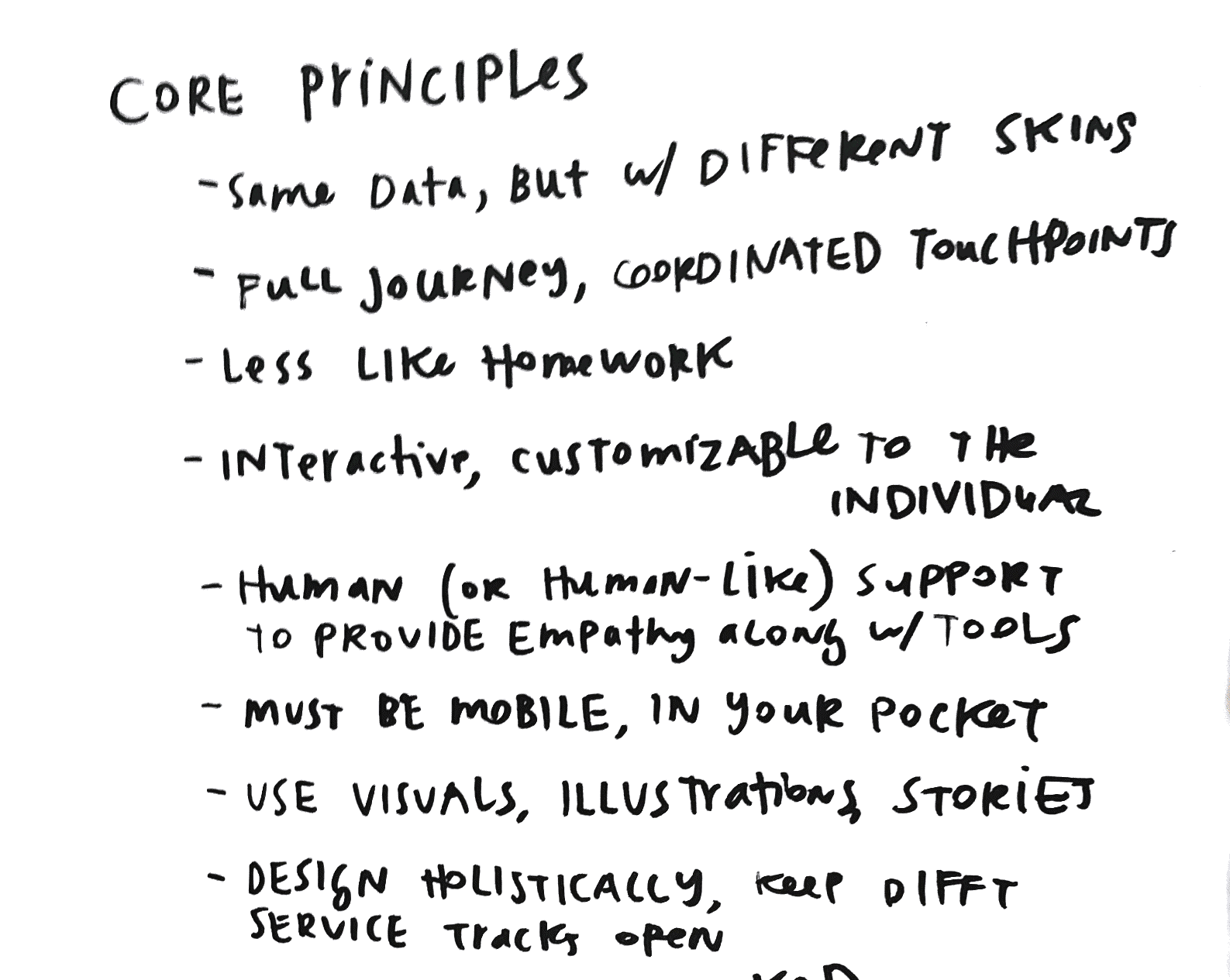
So without further ado, here are the 6 core principles of good legal design.
1.Make the users of legal services more empowered and intelligent.Many people want more input and oversight of the process they’re going through. They want a collaborative relationship with their advocate.

Good legal designs will bolster this person to understand what’s going on, and be strategic in making their way through it. Give them more tools to comprehend the legal system, spin out scenarios about how it can play out, and to work with their lawyers.
2. Provide process-based views of legal work to empower professionals and lay people who are working on a matter. Show a person how the system works step-by-step process. Like a board game, show them the various pathways, and what their start and end points are.
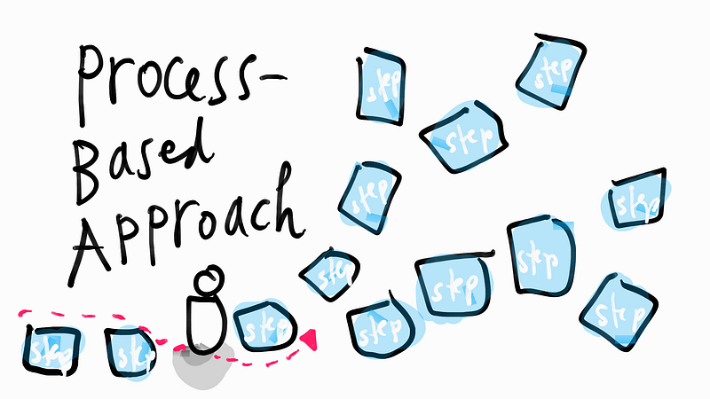
The metaphor of a journey is a powerful and resonant one for laypeople encountering the legal system. A good legal design will use this journey metaphor, and clearly show what the user’s given path is, so the user will understand what’s happening, where it might lead, and who is doing what.
3. Foster a collaborative relationship between the person and the advocate. In the past, lawyers often times thought of themselves as the ‘adult’ and the client as the ‘child’ — hiding details from them, not explaining why they were doing things, and not expecting them to contribute much.

What we see in our user research, though, is that many types of people want to have a larger role in their own advocacy. They want to gather information, understand their options and strategies, and to oversee the process that their lawyer (or other advocate) is carrying out for them.
Good legal design should provide tools, strategies, and templates for relationships that can be more two-way rather than one-way, and that give people a sense of transparency and of dignity when interacting with professionals who are representing them.
4. Always give the Bird’s Eye View that Swoops In. When we talk to lay people about what they want to be better informed, they consistently request a map. They want to see a zoomed-out version of what the legal terrain that they’re on looks like, as if they were using Google Map.
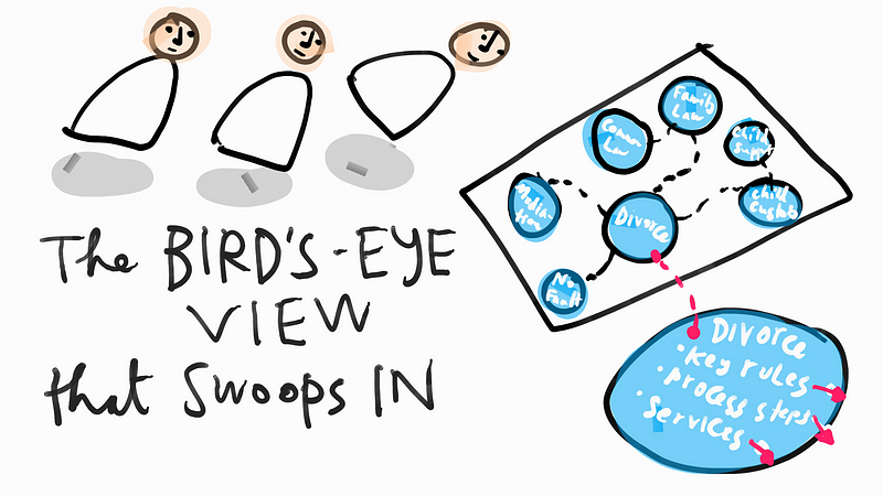
Giving a bird’s eye view to a person lets them understand context, and why they are doing what they are doing. Good design will give them perspective and transparency about the system they’re embedded in, and what paths are available to them.
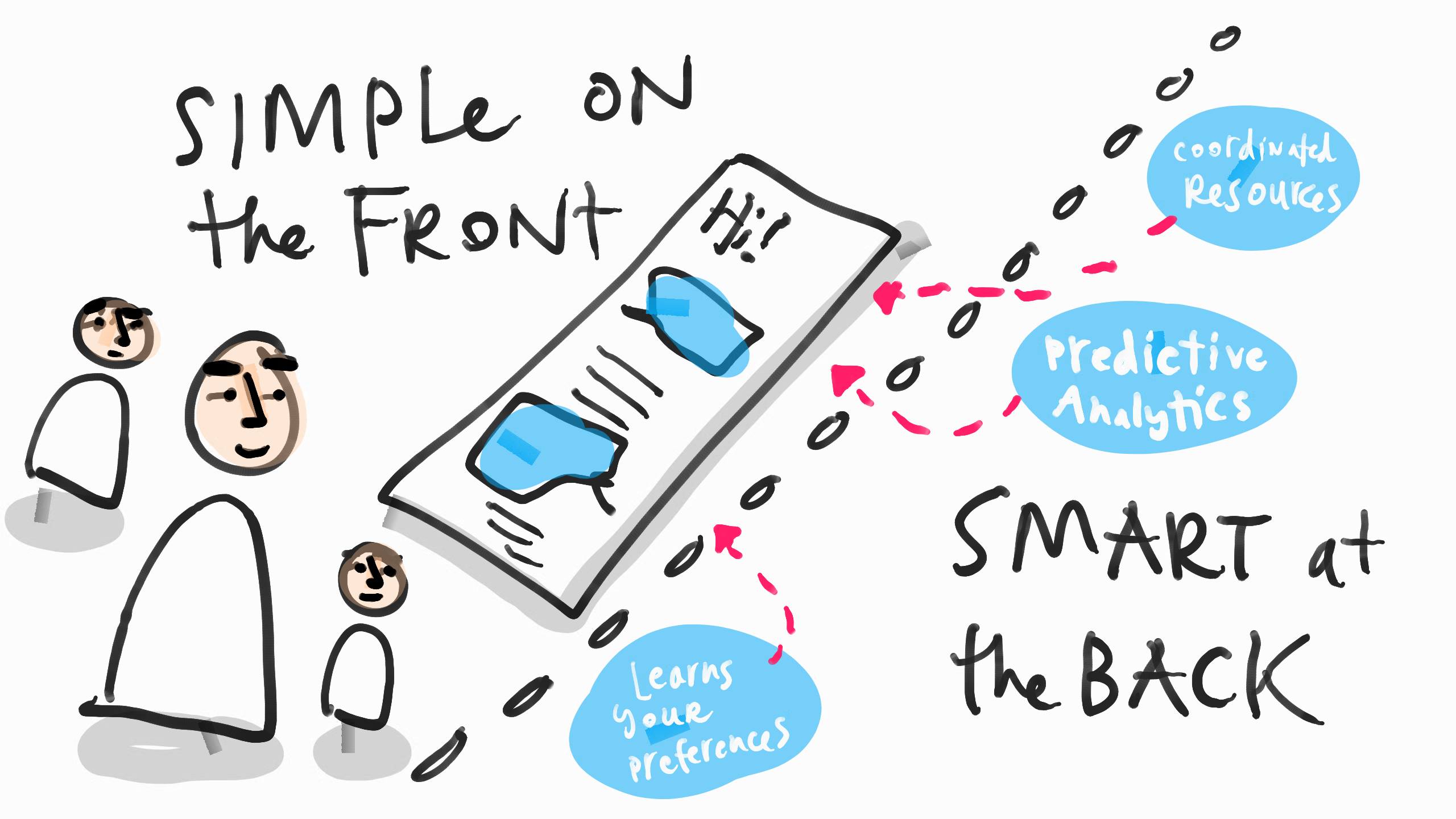
5. Be Simple on the Front, and Smart at the Back. Any tool or interface should give a guided, limited path for a person to follow. People don’t want a lot of choices to make — they want to be told what the best strategy for them (and for most people) is, and then to follow it. Giving too many options or information hinders engagement.
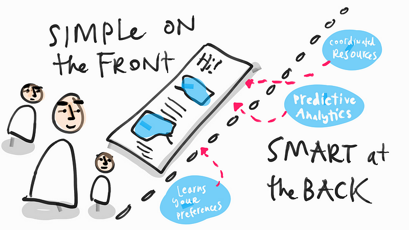
How to present this simple, streamlined guidance responsibly? Harness research, data, and user testing to figure out what the best way to simplify content and to suggest defaults. Do the work of making strategic choices and boiling information down to its essentials, rather than dumping all the content and choices on the end-user.
Or, even better, learn from a person’s past behavior and expressed preferences to give them the streamlined experience specific to them.
You can still present the details, or the non-default choices in links and stages — so that they are there, but still allow most users to flow through the default path.
6. Provide Multiple Modes that Let People Customize the Experience.We know that not all people like to take in information in the same way. Some people are visual, others like to read. Some like to be totally in charge and dig into reasons and background information. Others want to stay high level and delegate analysis and decision-making to others.
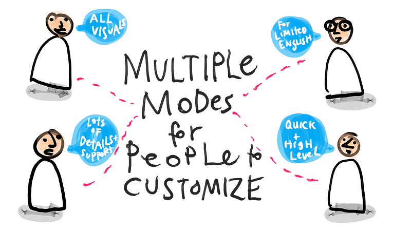
Other key differences: people who are tech-enabled, or even mobile-only, versus those who want paper hard copies. Or those who have limited English proficiency or a disability.
A good design will make the same content available in multiple modes, to account for these different types of users. That means investing in pushing the base content onto multiple platforms: papers, posters, brochures, reports, mobile-friendly websites, SMS, Facebook, WhatsApp, and beyond. Wherever your target users are, go there and present your content in that format.
Don’t just create a PDF text document of your information and resources and leave it there. Make the content come alive, send it out through many channels, and give your user the ability to experience it in multiple languages, text and visual media, and with both the quick-high level version (see the Simple at the Front principle) with lots of details a click away for the questioners.
This may sound like a lot of work, but if you truly want your audience to find your excellent legal information and resources and to be able to use it — it’s worth investing in creative, wide, and customized versions of it.
These 6 principles for Good Legal Design is what I’ve gleaned from the past few years of workshops, product development, and user testing. Surely there are more good rules to follow — let us know what you think also deserves to be on this core list.
And, like any good principles, there will surely be exceptions, when they aren’t the best rule to follow. If you can think of any situations when not to follow any of these principles, note it in the comments — I’m happy to hear your experiences.