I am working with a team at Carnegie Mellon to create more Usable Privacy Policies. One of the main deliverables we’re creating is a plugin for web browsers, that shows the user information about the site that they’re on. The goal is to present information about the site’s legal and privacy policies in compelling ways, so the person visiting the site will be a more critical consumer of it.
The plugin would be an intervention just-in-time, as the user has arrived on a site & is assessing whether she wants to stay there, explore it some more, or give it her usage data if not also subscription. How do we help her be smart about whether she wants to use that site & accept its privacy practices?
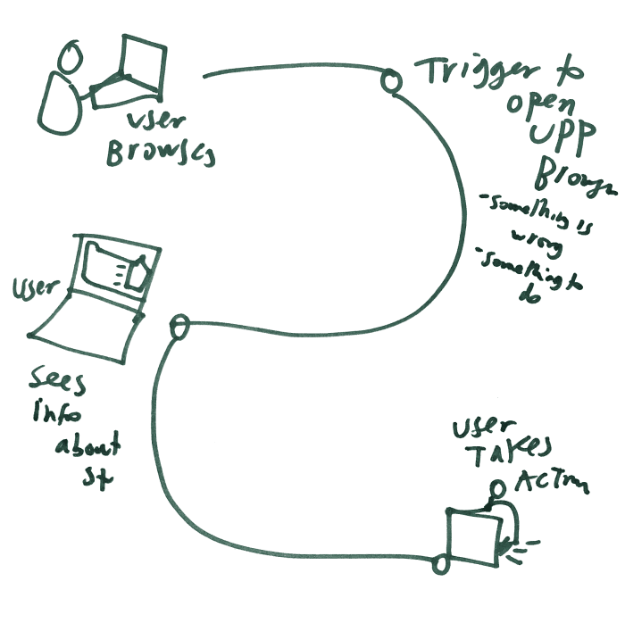
Back in May, I worked with one other leader of this project, Pedro Leon who is a fellow at Stanford Law School’s Center on Internet & Society, did a design sprint to create sketchy mock-ups of what some different browser plugins might look like. Our goal was to create paper mock-ups of possible browser interfaces, that we could do some quick testing with on that day, and then refine them into proper digital mockups to test in focus groups and online.
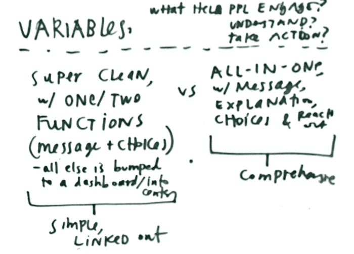
We tried to capture a range of different messages, compositions, moods, and hierarchies. For our first round of designs, our concepts ranged from the hyper-complex to the hyper-simple. Our main line of variables was along how much information we presented.
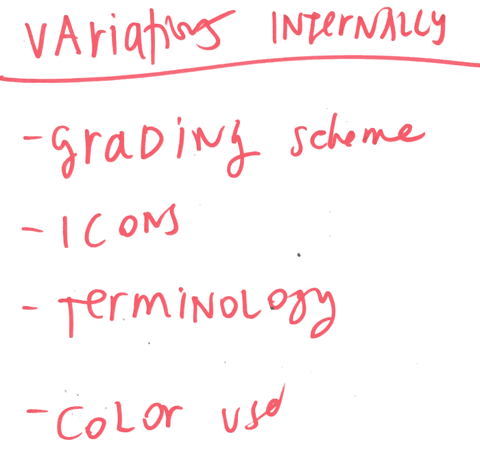
We also were cognizant of possible variations in elements & composition that we could use in putting together possible plugins.
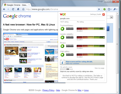
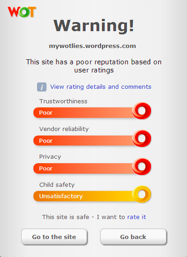
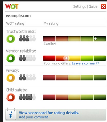
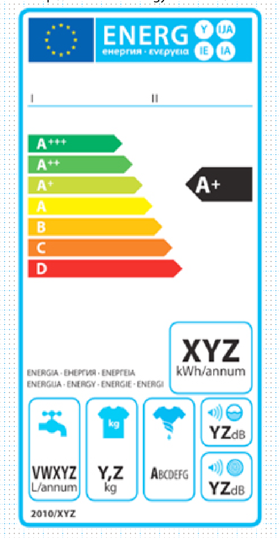
And we also drew on some other inspiration & analogies for how we could present information like privacy ratings.
Mock-ups of possible privacy plug-in interfaces
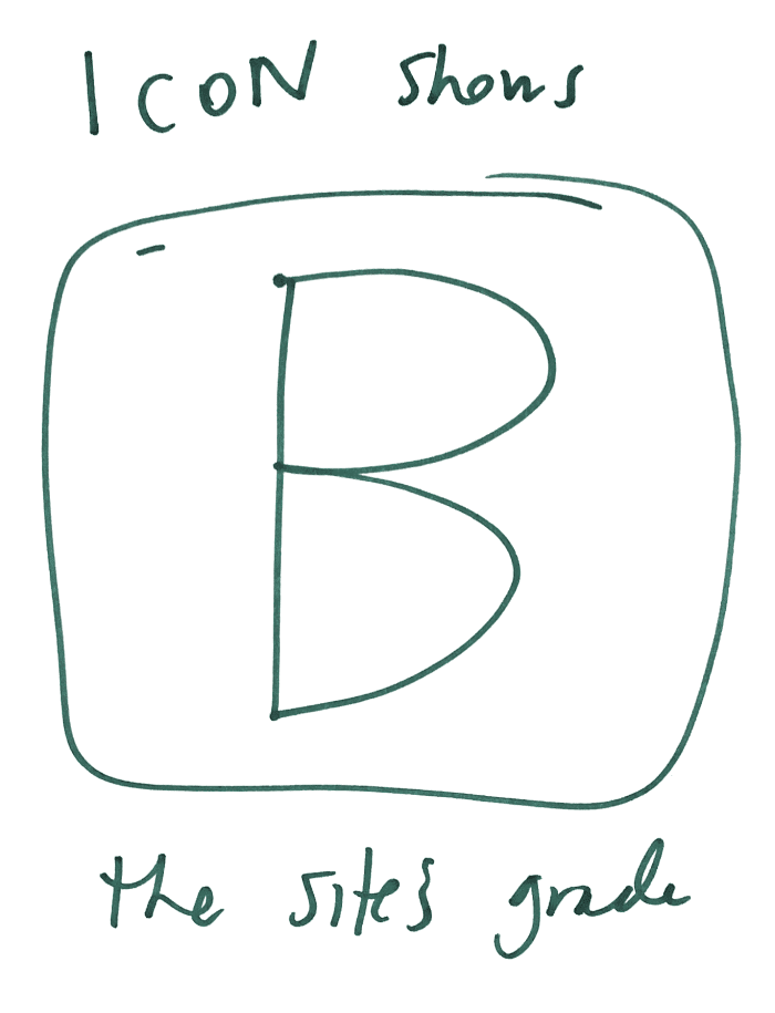
Along the axis of simple to complex information, we created some very raw sketches of what a plug-in interface could look like.
Here’s the most simple: a single grade and some links to see what this grade actually looks like:
We didn’t necessarily think this super-simple grade would actually be the most effective or user-friendly interface, but our goal was to stretch our own imagination about what’s possible and divine the right amount of simplicity-information balance.
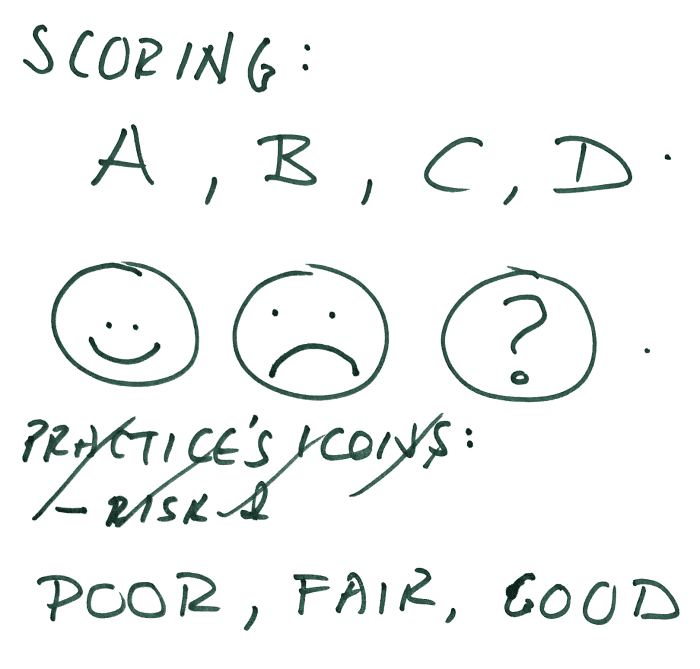
A slightly more complex interface (but still on the simple end of the spectrum) is a letter-score plus some more, very simplified markers of a score — emoji faces, a text description, or something that gives a very glanceable impression of ‘is this good or is this bad?’
From these very stripped down designs, we started to get to more plausible, and richer designs — though we still tried to keep the amount of information to a relatively simple & digestible quantity. Here are some slightly more complex interface sketches.
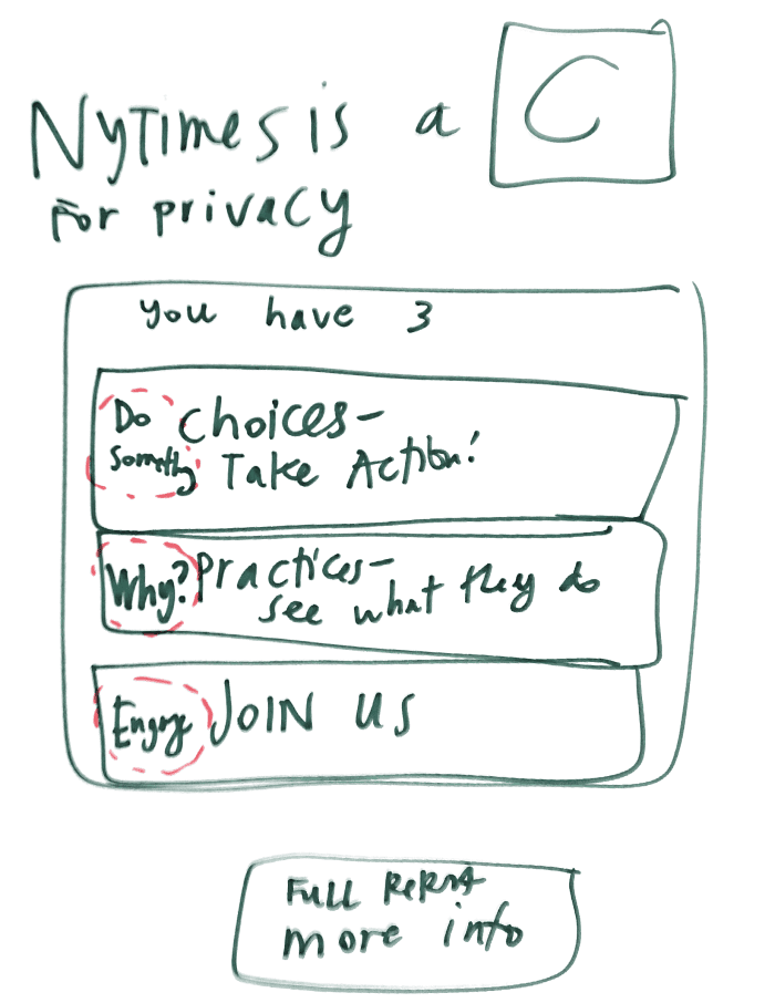
This design is the Letter-Score plus 3 possible actions for the user to take in response:
The thought was to give a simple rating/assessment, combined with user choice to make it more actionable and empowering. We created a few more slightly complex variations of this theme: rating plus user choice.
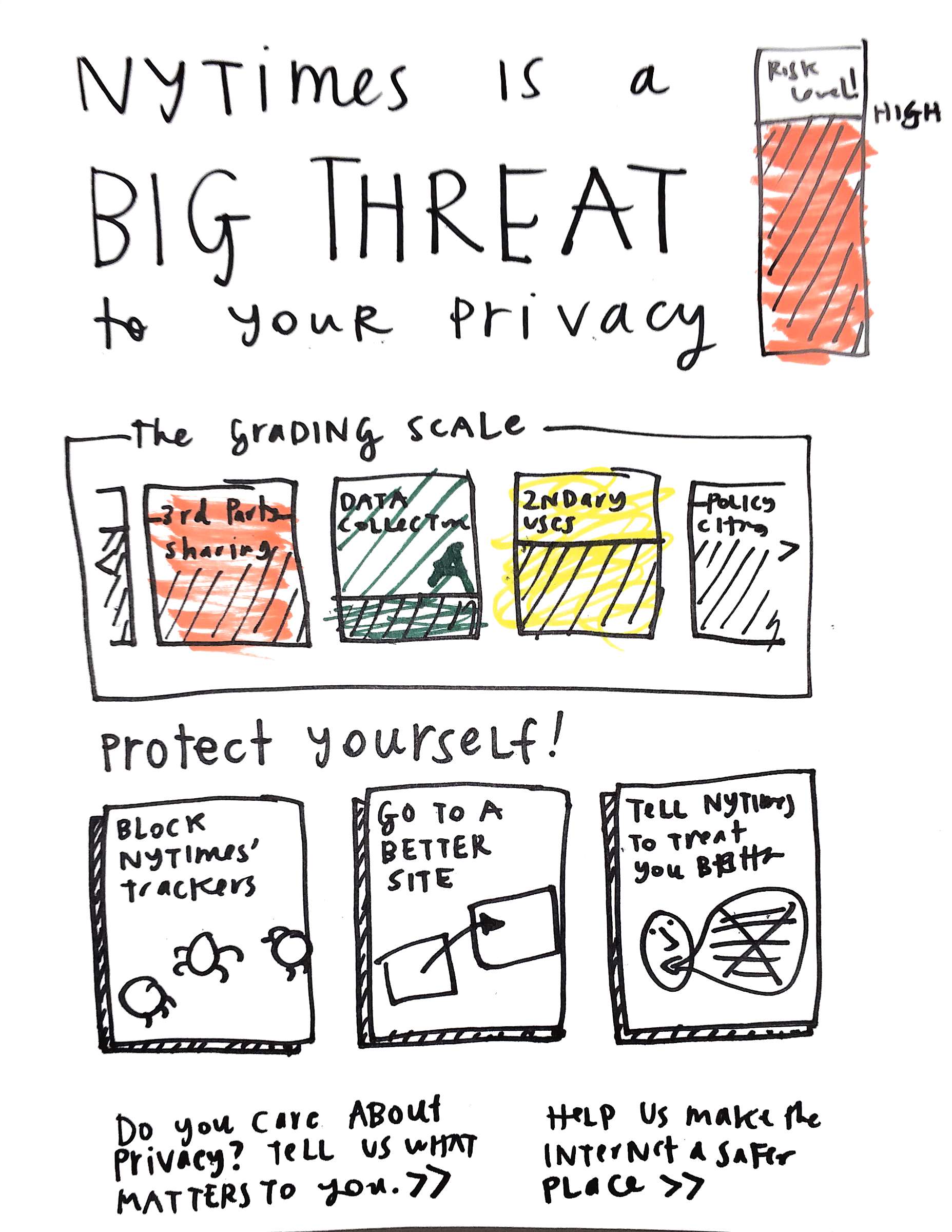
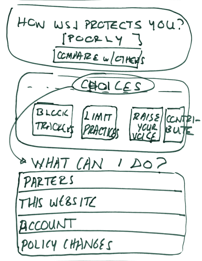
Here is one design, with a Rating plus many User Choices — the emphasis is on a quick alert about the rating of the site, and then following up with a large menu of possible responses that the user is able to take in order to protect herself and send her preferences to the site and wider community.
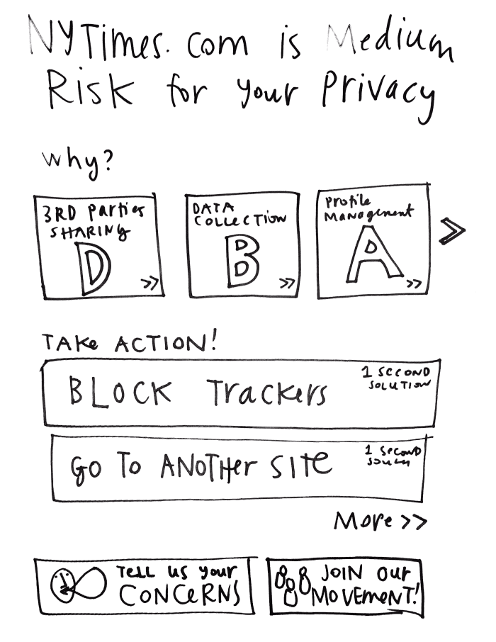
We also created a collection of interfaces that give some more detail to the rating, pairing an overall score with a breakdown of sub-category scores.
Here is one Rating – Sub-rating – Action design:
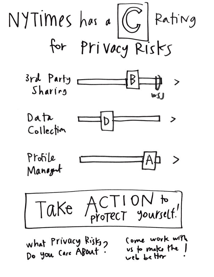
And another Rating – Sub-rating – Action design, this time with sub-ratings on a scale (potentially with other competitor sites also featured on the scale to show comparisons):
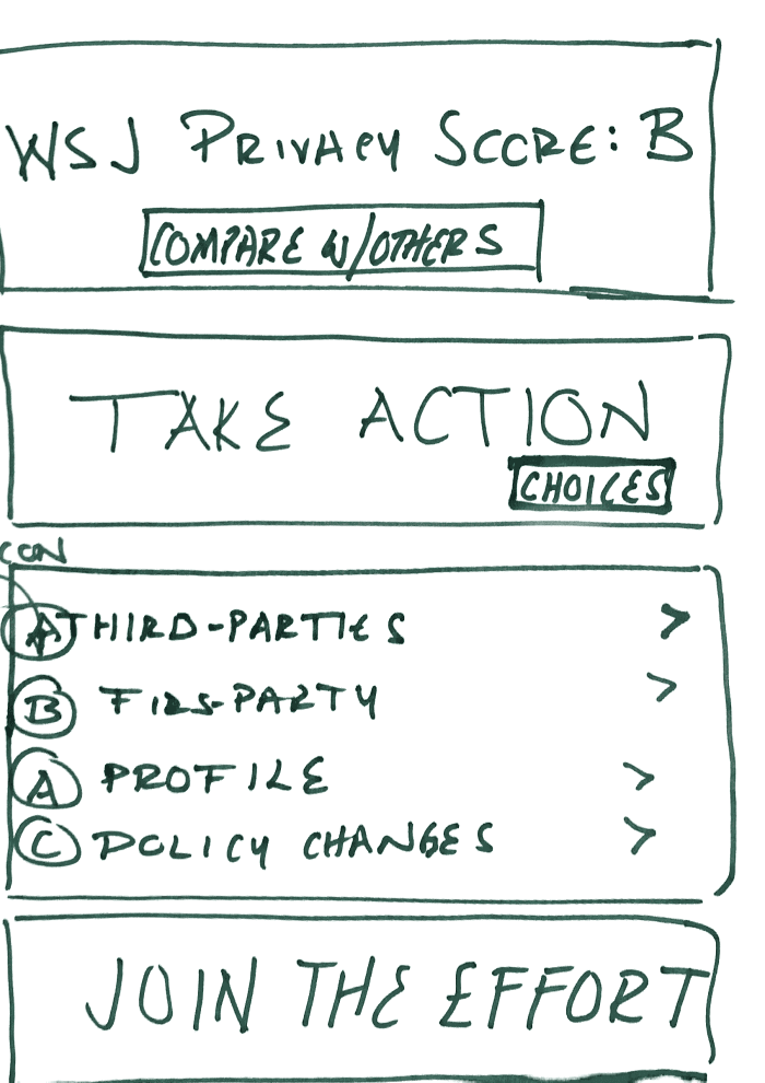
And one last Rating – Sub-rating – Action design, this time also with a ‘comparison’ option woven in, to allow the user to shop around for other options besides the page they’re currently on:
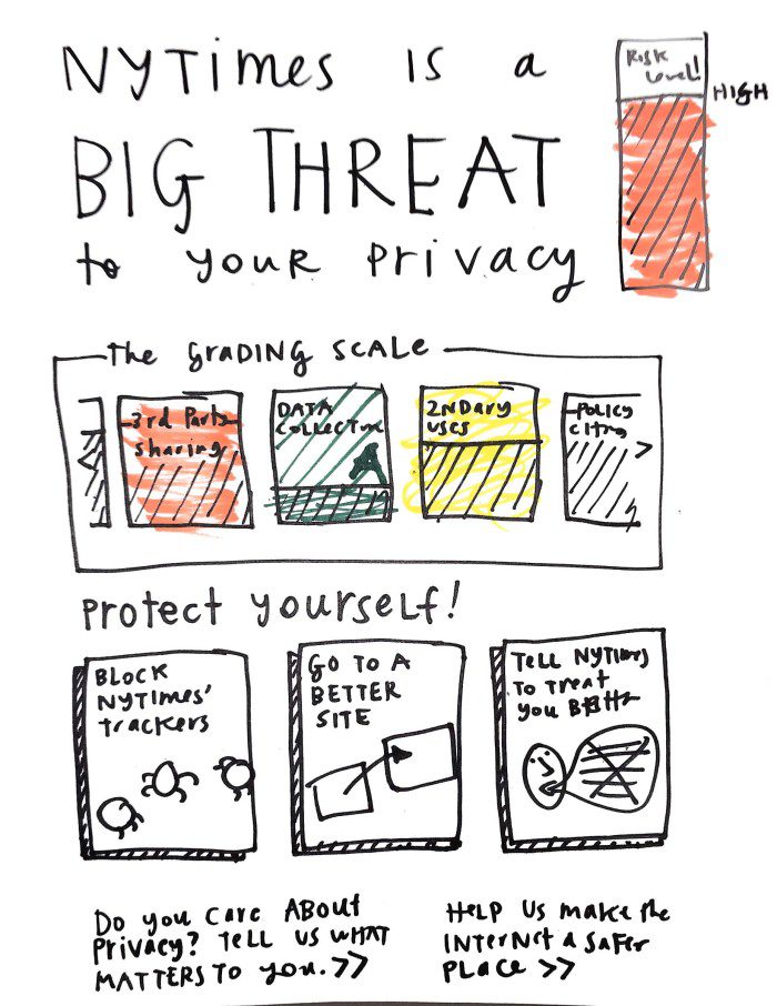
Here’s a design with the same information pattern Rating – Sub-rating – User Action, but with more visual elements. We took a card & icon based approach, to use less text and more graphics to show off the info.
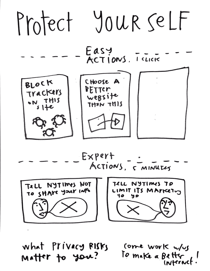
And one other design was focused totally on User Choices, giving a whole visual menu of actions to make the user feel empowered & activated.
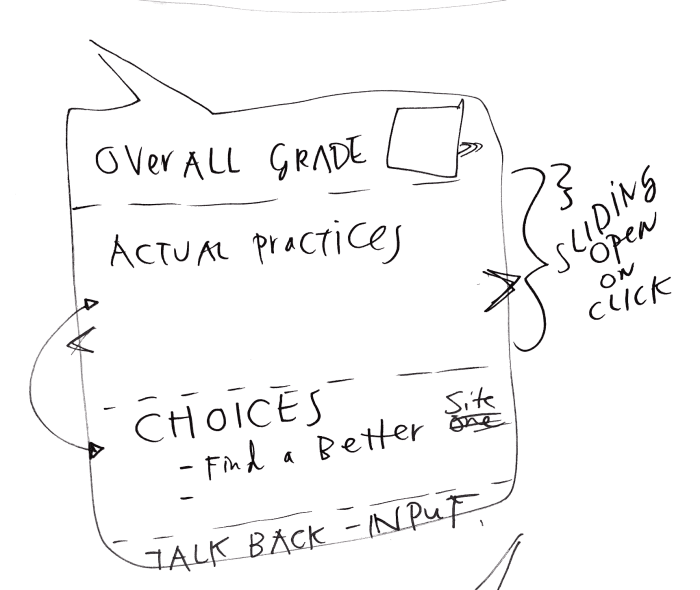
And a final sketch was to have all kinds of information — rating, sub-rating and explanation, choices, and participation invitation — but to have it selectively displayed through sliding displays where the complexity is only shown upon click or hover by the user.
Testing Results
So what did our initial, quick testing of these interfaces tell us? Our main message actually upended much of our design hypothesizing. The key factor in the user response was not the amount/complexity of information, but rather the tone, mood, and framing of the message. Though users did show some interest in the amount of detail when assessing how trustworthy & useful the plugin was — the real factor in whether they would use it or not was ‘is this plugin neutral, reliable, and apolitical?’
The user testers were aware enough of privacy and the importance of it, but they did not want any kind of presentation that seemed too radically pro-privacy or anti-tracking. They do not want the sense that the makers of the plugin have a strong agenda as to what is good or bad when it comes to how companies gather data about their users. Rather, they want ratings and recommendations that seem to be neutral, apolitical, and based on clear & authoritative standards.
The language that we had used in our quick sketches alienated the user testers, because it seemed to be too bossy, strident, and like an advocacy group.
Instead, the users said they’d rather something like Film Ratings (G, PG, PG-13, R) that seem to be quite objective and without explicit messages that say whether things rated this way are good or bad. Rather, the people who have rated films seem to just be putting out the neutral rating out to the public without telling the public how they should they react or whether the film is good or bad.
They also suggested that we follow the model of Commonsense Media, an organization that rates movies, tv, games, and other media as to whether it’s family-friendly and kid-appropriate or not. According to one tester, Commonsense does an excellent job at making its ratings persuasive because they do it with a strong veneer of neutrality. They do not use highly-charged language, they do not condemn or use political messaging, and they leave it up to the parents to read the ratings and decide what their response should be.
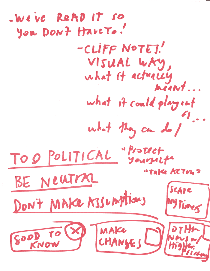
The main lesson learned from the testing is the importance of language, framing, and messaging. Complexity to simplicity of information presented is important, but even before that, we must care about how we present the tone of information. We must aspire to neutrality & authority by avoiding words like ‘threat’ and ‘risk’, and not calling for too much advocacy or political change. We must show the user respect, by encouraging them to decide what they want to do with our ratings. And we must clearly show that our ratings are based on objective and reliable standards, and not arbitrary or politically-charged.
The second lesson is to frame the plugin as something that saves the user time, giving them the luxury of a shorthand & easy version of something that they want to know but don’t want to spend time on. The users want a Cliff Notes version of privacy information. The value proposition that would get the user to download the plug-in in the first place (and then not delete it later) – is “We (smart lawyers or the like) have read it so you don’t have to!” or “You care about privacy but you don’t have time to figure it all out — let us help you do it quickly, cleanly, and in an empowering way”
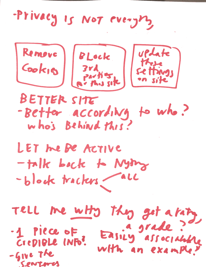
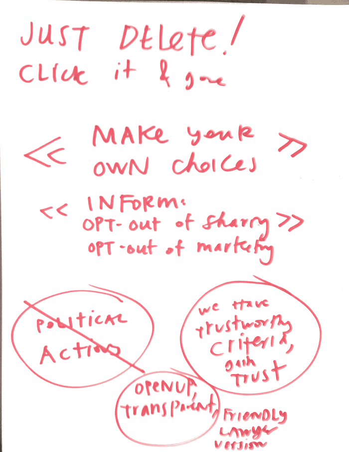
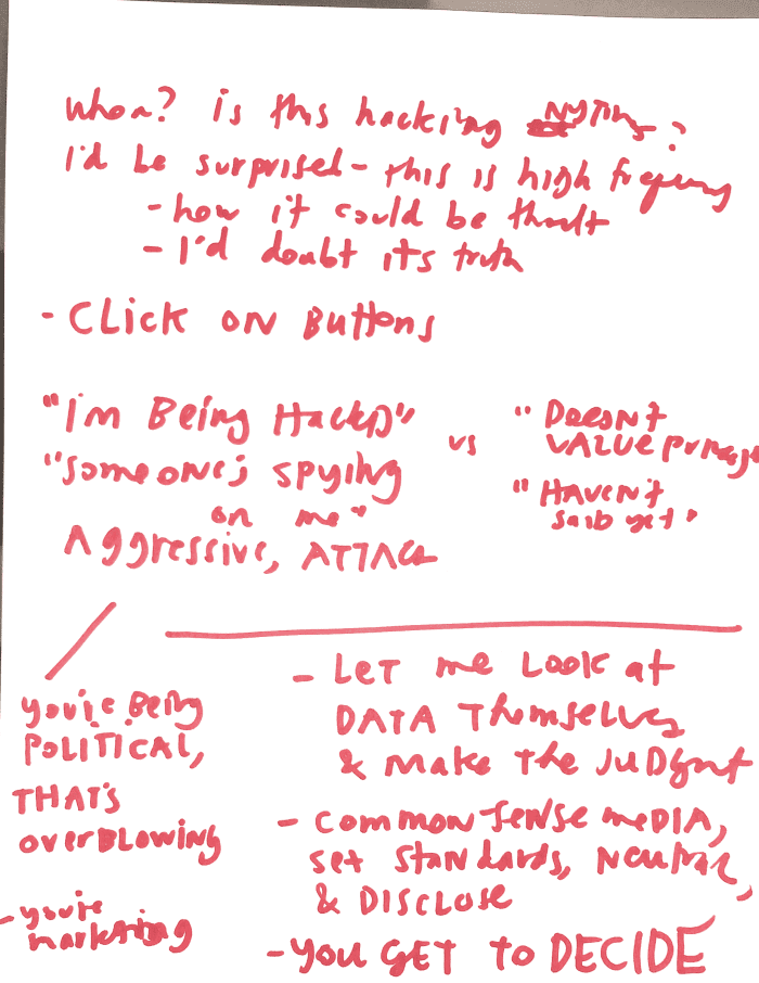
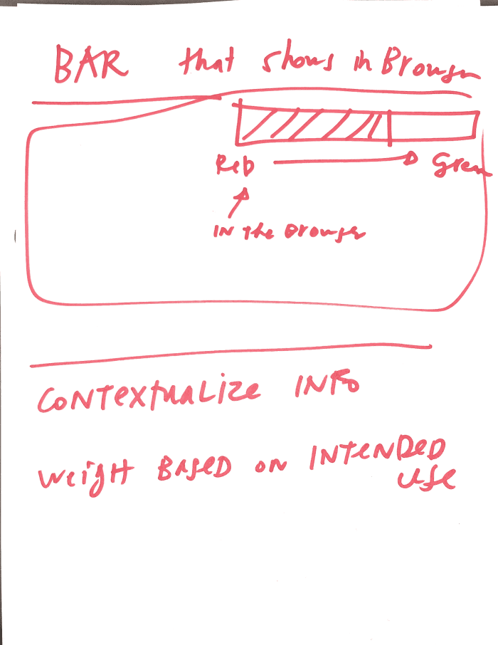
Here are my notes, taken during the testing session.
Design Notes
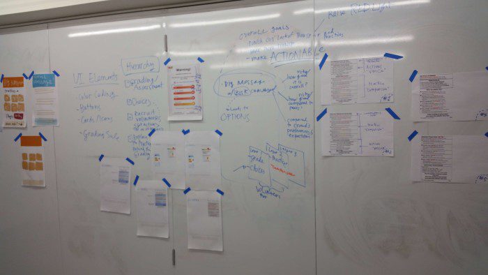
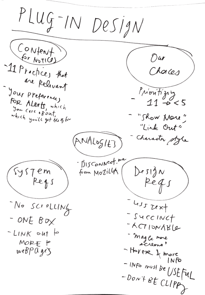
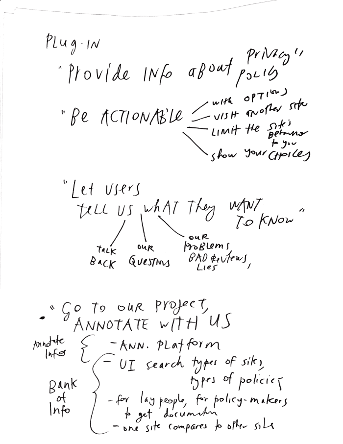
As an addendum for the design process-geeks out there, here is some documentation of how we ended up at our designs & how we are moving forward. Before we actually took pen to paper to make our rough mock-ups, we had gone through what the essential content, elements, and user/system requirements would be for our plug-in design. These were constraints and options we could play with.
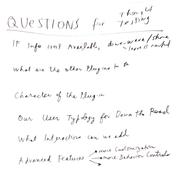
Here are some of the questions that we have to grapple with as we craft our designs, message, and experience:
We fleshed out user requirements for what the plug-in should provide functionally, as well as what impression and experience it should create with the users.
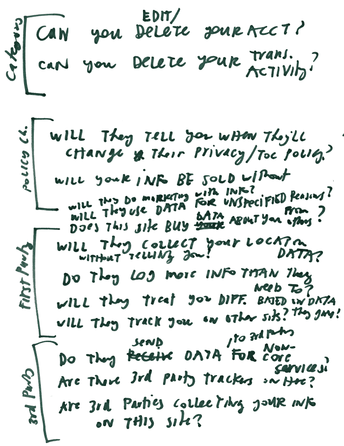
And here are the types of content that we can be displaying in the plug-in (though we can prioritize and hide some of these):
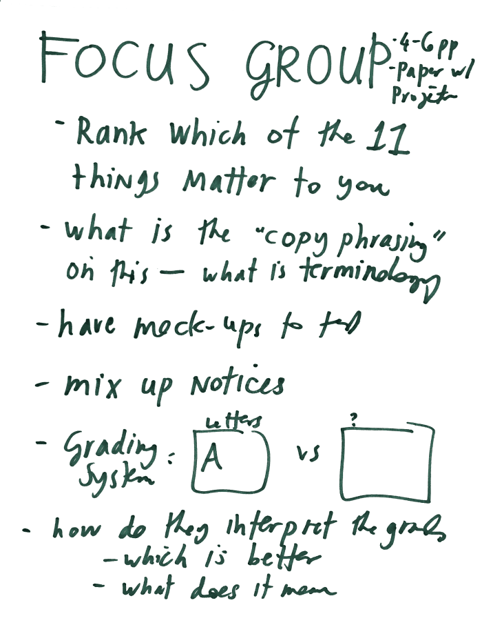
Finally, here are notes on the next battery of testing we’ll run in focus groups:
Stay tuned for more updates — more beautiful & refined interfaces — and testing results from these focus groups!

1 Comment
Great post, Margaret. Thanks for sharing your process. The tool looks to be useful. Striking the balance between alerting the user and having the tool to be too distracting is a challenge. One suggestion I have in response to user comments about the language being too strident is to effectively use icons or even simple illustrations. Visuals can instruct and have a tone (if you choose) that will be easy to read and be less ‘bossy’.