I was excited to see a concept design for a Parking Sign featured in Wired Magazine– that would communicate a legal warning/penalty quite clearly to the people who are living under the regulation.
It links back into the d.school class Get Smart, on good legal communication design, that I taught this past Spring at Stanford.
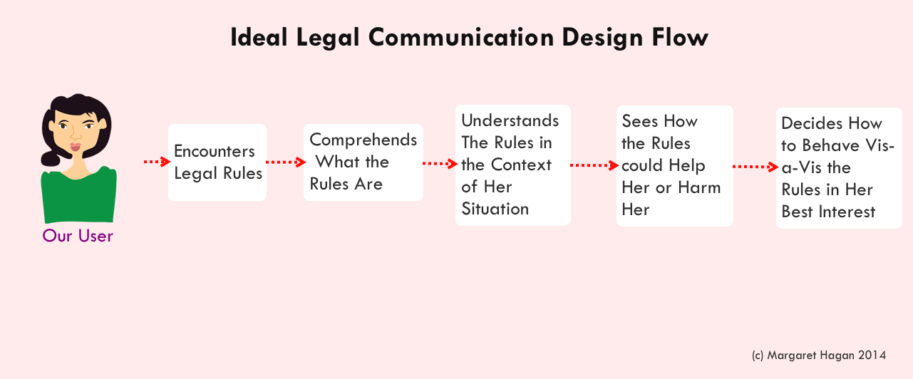
For that class, our driving question was:
How can we help normal people understand the laws that apply to them — and with this understanding, make good decisions that benefit their best interests?
One of the exercises our class ran through was similar to the Parking Sign Design. It was on how Bay Area commuter train Caltrain could communicate to its riders how to avoid fines and tickets. Their rules are notoriously complicated — with so many different payment systems & schemes that it’s remarkably easy to violate a rule and get fined $300.
Our students came up with many different signs, recordings, and interventions that would make the rules more visual — and also more contextual, presented at the moment when the commuter would be making the choice that could get them in trouble.
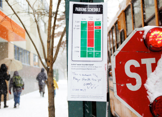
These same good design principles and choices appear in the Parking Sign concept design from designer Nikki Sylianteng. She has drafted a schedule-based sign to replace the text-based parking signs that hang next to spaces. The schedule should give a clear visual of exactly when you’re allowed to park somewhere, and how much it will cost.
The genius of the design is that it lifts the burden from the parker, of having to parse the short text on the sign and try to apply it to their immediate context. Rather, it concisely displays the rules for any time, so that the parker has a lot less mental work to do — just consider what time they want to park, and see how it corresponds to the posted schedule of rules.
This Wired article from Liz Stinson, “A Redesigned Parking Sign So Simple That You’ll Never Get Towed | from Wired Magazine,” profiles Sylianteng’s design work.
Your car gets towed, and who do you blame? Yourself? God no, you blame that impossibly confusing parking sign. It’s a fair accusation, really. Of all the questionable communication tools our cities use, parking signs are easily among the worst offenders. There are arrows pointing every which way, ambiguous meter instructions and permit requirements. A sign will tell you that you can park until 8 am, then right below it another reading you’ll be towed. It’s easy to imagine that beyond basic tests for legibility, most of these signs have never been vetted by actual drivers.
Like most urban drivers, Nikki Sylianteng was sick of getting tickets. During her time in Los Angeles, the now Brooklyn-based designer paid the city far more than she would’ve liked to. So she began thinking about how she might be able to solve this problem through design. She realized that with just a little more focus on usability, parking signs could actually be useful. “I’m not setting out to change the entire system,” she says. “It’s just something that I thought would help frustrated drivers.”
The downfall of most parking signs is that they have limited real estate to communicate what seems like unlimited conditions and restrictions. Instead of using a text-based design, Sylianteng translated all of the information into a visual explanation that answered two main questions: Can I park here? And for how long? “I just visualized what I construct in my head when I’m reading the sign,” she says.
The sign has undergone multiple iterations, but the most recent features a parking schedule that shows a whole 24 hours for every day of the week. The times you can park are marked by blocks of green, the times you can’t are blocked in a candy-striped red and white. It’s totally stripped down, almost to the point of being confusing itself. But Sylianteng says there’s really no need for the extraneous detailed information we’ve become accustomed to. “Parking signs are trying to communicate very accurately what the rules actually are,” she says. “I’ve never looked at a sign and felt like there was any value in knowing why I couldn’t park. These designs don’t say why, but the ‘what’ is very clear.”
Sylianteng’s design still has a way to go. First, there’s the issue of colorblindness, a factor she’s keenly aware of. The red and green are part of the legacy design from current signs, but she says it’s likely she’d ultimately change the colors to something more universal like blue. Then there’s the fact that urban parking is a far more complex affair than most of us care to know. There’s an entire manual on parking regulations; and Sylianteng’s design does gloss over rules concerning different types of vehicles and space parameters indicating where people can park. She’s working on ways to incorporate all of that without reverting back to the information overload she was trying to avoid in the first place.
Sylianteng has been going around Manhattan and Brooklyn hanging up rogue revamped parking signs. “A friend of mine called it functional graffiti,” she says. She’ll stick a laminated version right below the city-approved version and ask drivers to leave comments. In that way, Sylianteng’s design is still a ways away from being a reality, but so far, she’s gotten pretty good feedback. “One person wrote: ‘The is awesome. The mayor should hire you.’”